Accessibility couldn't be an extra
Anyone might use an adoption site: with a screen reader, with only a keyboard or with low vision.
I build sites that are truly accessible: semantic HTML, WCAG AA contrast and a form you can complete from start to finish with a keyboard.
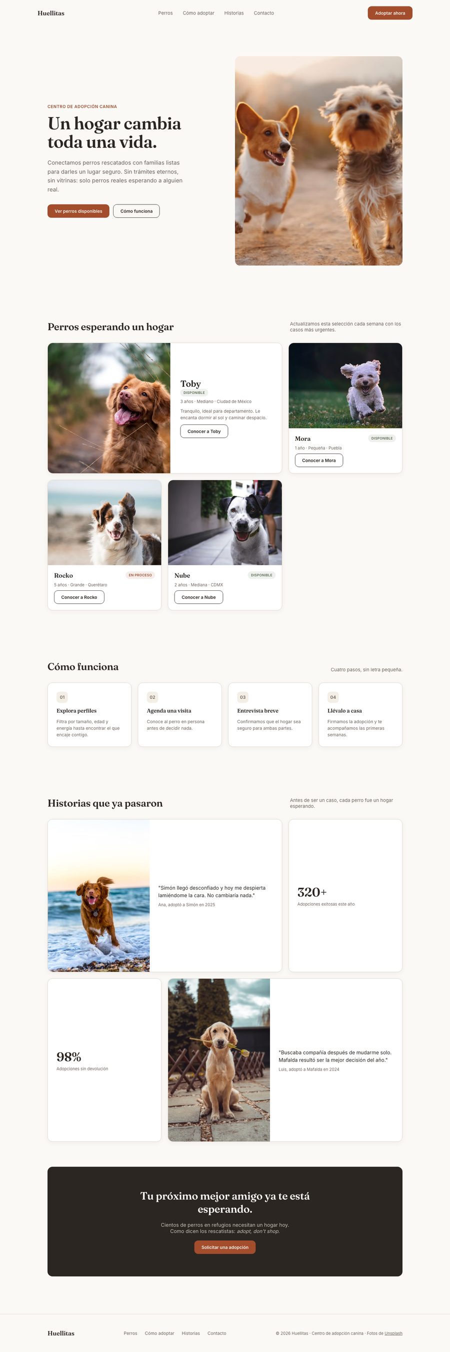
Anyone might use an adoption site: with a screen reader, with only a keyboard or with low vision.
Semantic HTML, contrast checked against WCAG AA, labels and hints linked to every field, and visible focus throughout.
A landing page with an adoption form you can complete from start to finish without a mouse.
Every field has its label, the housing type uses fieldset and legend, and hints are linked with aria-describedby. If you arrive from a dog's card, that dog is already selected.
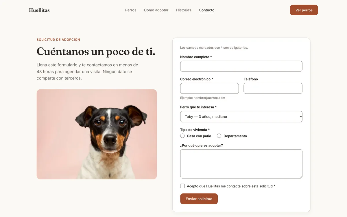
A skip-to-content link, a 3 px visible focus ring in the accent color and aria-current on the active page.
lang="es" on the page and lang="en" on English phrases; headings in h1 → h2 → h3 order and alt text that describes each photo.
Each field is linked to its label and to its hint text with aria-describedby, so screen readers read them together.
The result message lives in a role="status" region: it's announced without moving focus. If something is missing, focus jumps to the first field with an error.
<label for="email">Correo electrónico</label>
<input type="email" id="email"
       autocomplete="email" required
       aria-describedby="email-ayuda">
<p class="hint" id="email-ayuda">
  Ejemplo: nombre@correo.com
</p>

<!-- Announced on submit, focus doesn't move -->
<p class="form-status" id="formStatus"
role="status" aria-live="polite"></p>WCAG AA requires 4.5:1 for normal text, and AAA requires 7:1. The accent was darkened to #A34D2D so the button would pass.