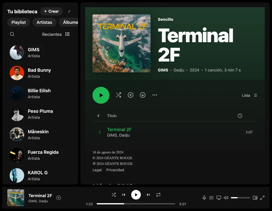
A desktop app in HTML and Sass
Reproducing a well-known interface, with three columns and a fixed player, without JavaScript or libraries.
I lay out complex interfaces with CSS Grid and modular Sass: this Spotify replica adapts to any screen without a single line of JavaScript.
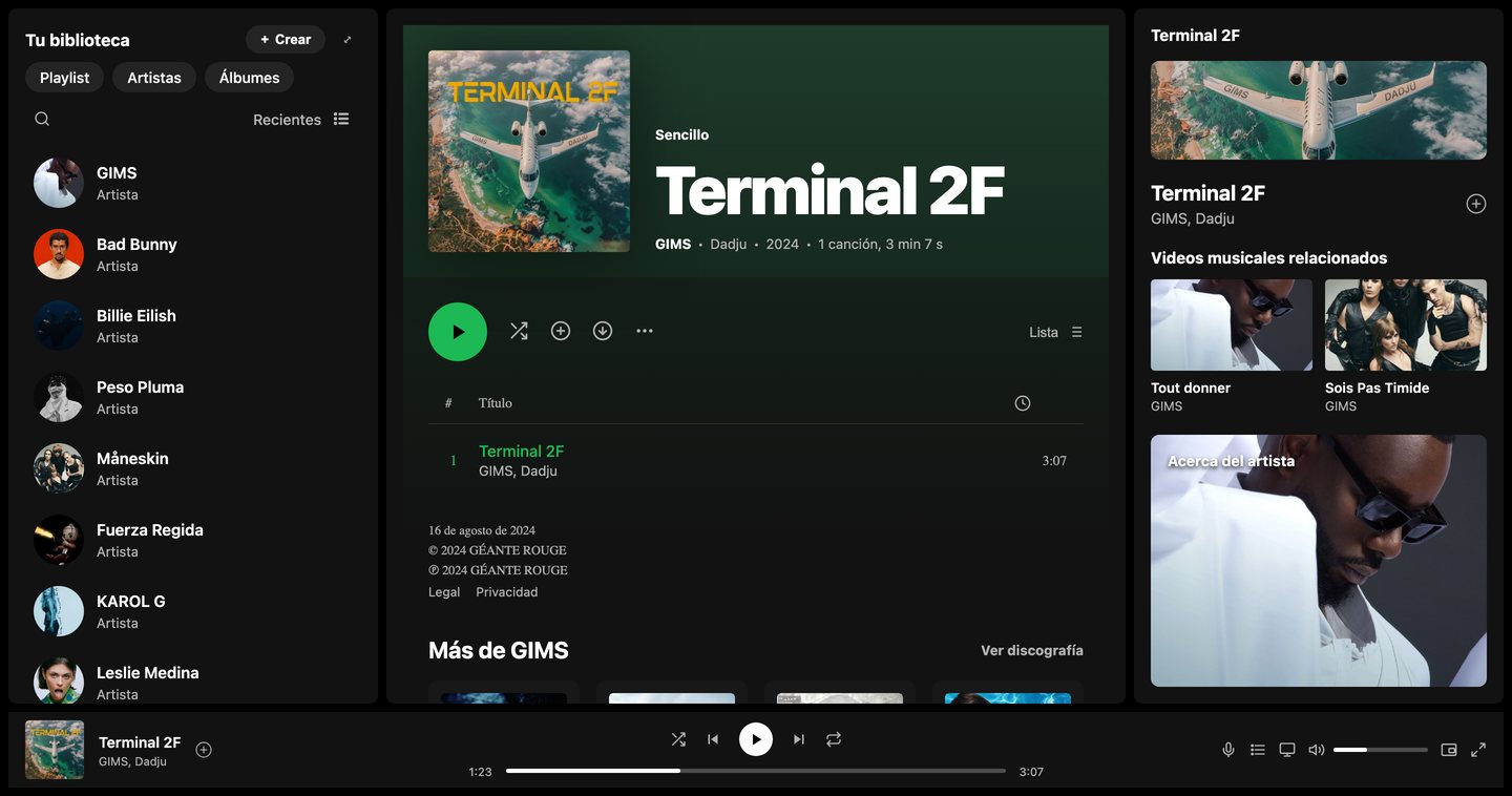
Reproducing a well-known interface, with three columns and a fixed player, without JavaScript or libraries.
The whole app is organized with grid-template-areas; styles are split into abstracts, base, components and layout.
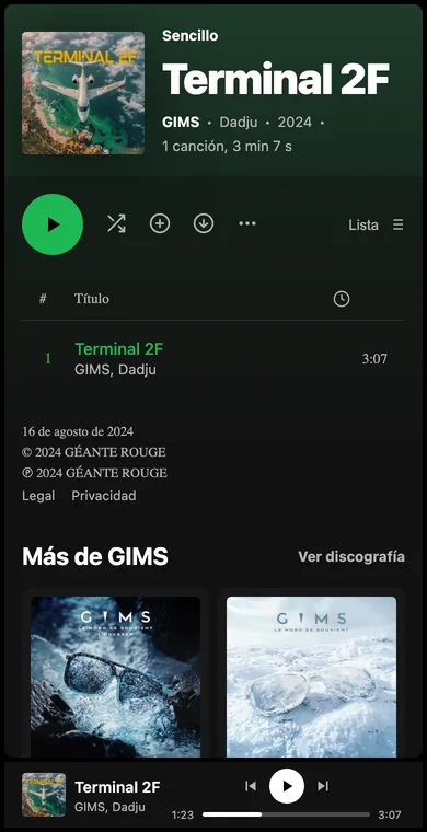
The view for the single "Terminal 2F" goes from three columns to one without losing the player.
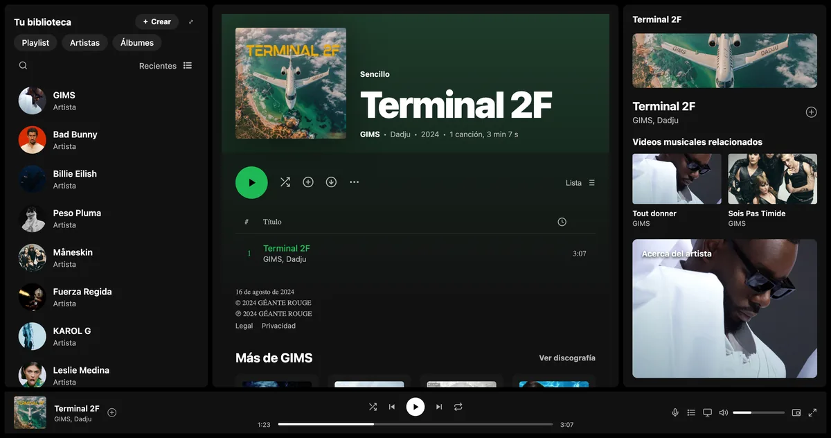
A sidebar with the library, a main view with cover art, tracks and discography, a now-playing panel and a fixed player. Each one lives in its own Sass partial.
Variables documented by group, mixins like rem(), truncar-texto() and circulo(), and placeholders like %panel to avoid repeating styles.
Backgrounds #121212 and #181818, the green #1db954 and the gray #b3b3b3 for secondary text, taken from the original interface.
Named areas describe the layout like a map: left sidebar, main view, right sidebar and, along the bottom, the player from side to side.
For tablet and mobile, it's enough to redraw that map in each media query; no component moves in the HTML.
.spotify__app {
  display: grid;
  height: 100dvh;
  grid-template-columns: minmax(200px, 1fr) minmax(0, 2fr) minmax(220px, 1fr);
  grid-template-rows: minmax(0, 1fr) 72px;
  grid-template-areas:
    "lateral-izquierda principal lateral-derecha"
    "reproductor reproductor reproductor";
}

// Tablet: the right panel is hidden, leaving two columns.
@media (max-width: 1024px) {
  .spotify__app {
    grid-template-areas:
      "lateral-izquierda principal"
      "reproductor reproductor";
  }
}